Strategic and visual design for Colorado-based body-positive beauty brand Bronzed.
Bronzed looked to update its brand identity in line with its customer experience, transforming a thin mark that was difficult to scale into a strong identity that retained the DNA of the original mark. Updated brand colors reflect inclusivity, while brand photography communicates body acceptance. The Bronzed visual brand is working to speak to the modern person, whoever they might be.


Logo application shows reversed logos and sunburst mark in use.

Updated signage offers a summary of services for street-side marketing and leverages a bigger, bolder logo. Packaging is updated with brand elements and brand colors.

Working with one of Bronzed's artistic stylists, the beauty brand was able to develop unique, ownable designs representing people of all ethnicities and body types. The designs were translated into vector art and produced to help promote the brand.

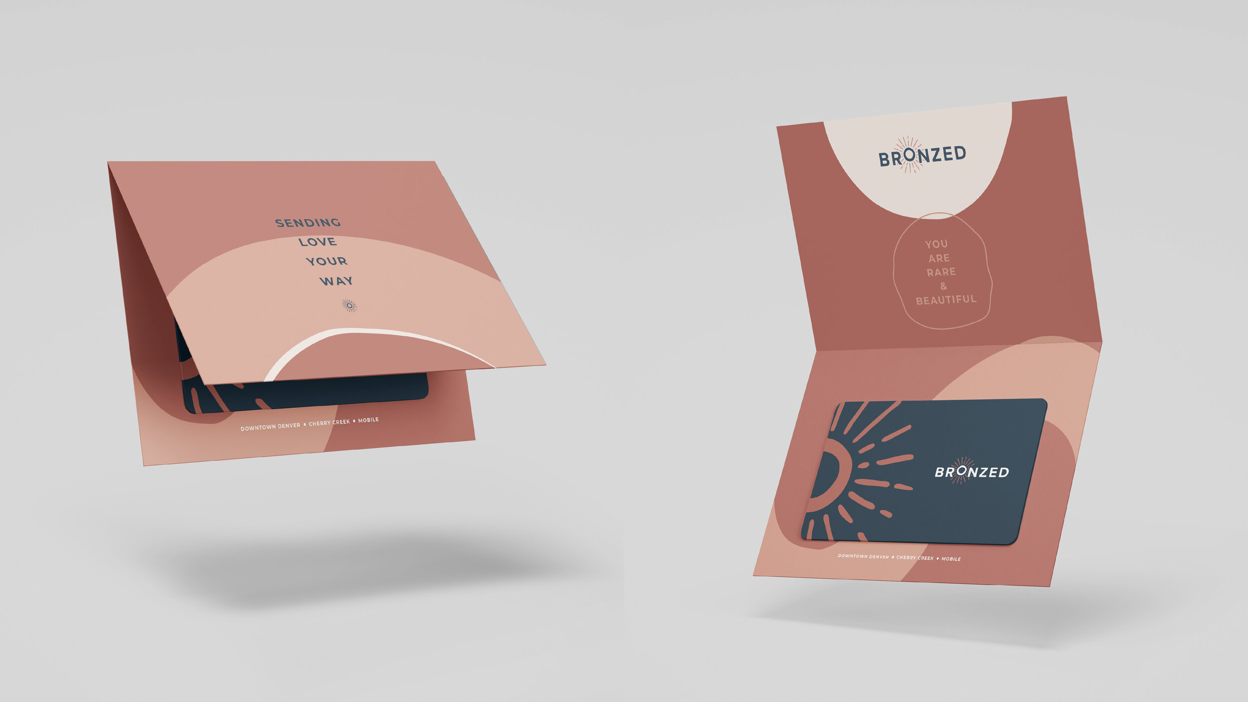
Gift certificate packaging brings a sense of approachability and welcoming to the brand.

Brand graphic element application.

A t-shirt playfully uses the brand sunbursts.

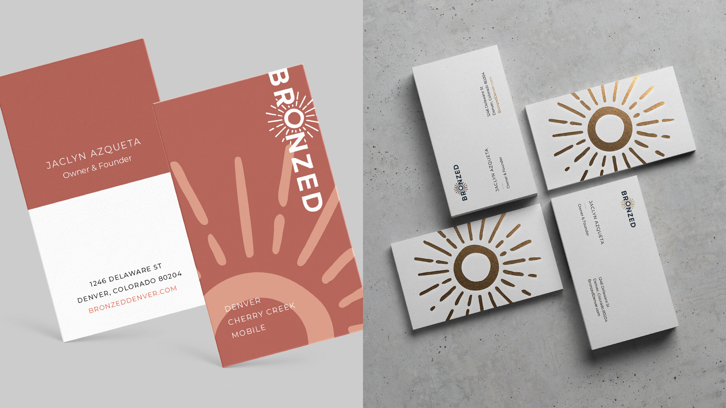
Two directions for business cards offers one more affordable option and one foil-stamped option.

An instruction sheet for post-airbrush tans shows the brand in use.

Further representations of the brand logos and graphic elements.

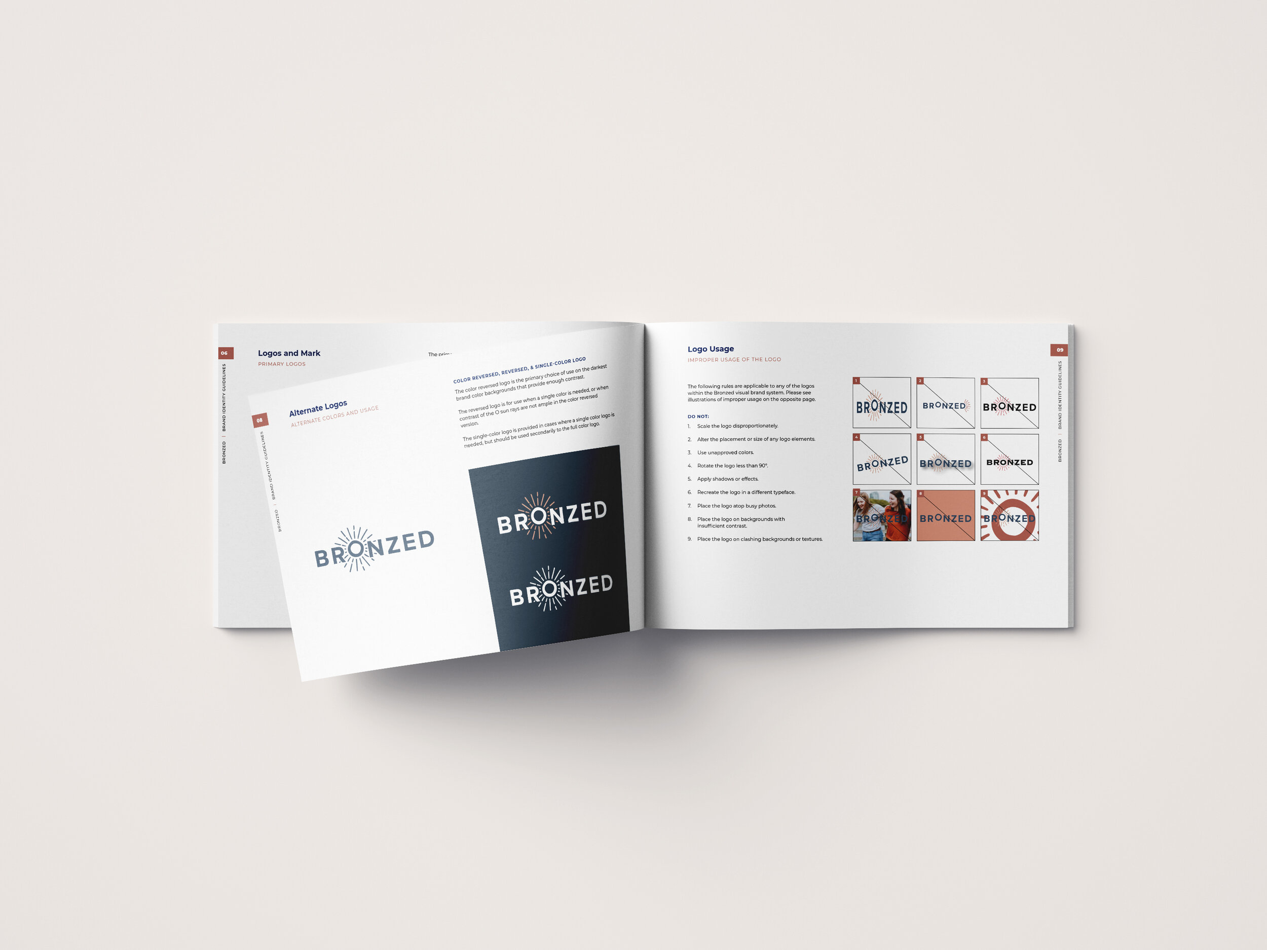
A brand guide outlines proper and improper use of brand application.
My roles: brand and website strategy, naming hierarchy strategy, brand identity design, brand guide, asset package delivery.